SiteHub 2.0 Platform Redesign
SiteHub 2.0 Platform Redesign
Redefined the user experience of a lease management SaaS platform by introducing a universal flagging system and reducing onboarding friction.
Redefined the user experience of a lease management SaaS platform by introducing a universal flagging system and reducing onboarding friction.
Overview
I stepped into the role of Product Designer for SiteHub, a lease management platform currently used by multiple clients to manage complex commercial real estate portfolios. My responsibility was to redesign the platform’s core workflows, aligning the product more closely with the evolving needs of its users.
I stepped into the role of Product Designer for SiteHub, a lease management platform currently used by multiple clients to manage complex commercial real estate portfolios. My responsibility was to redesign the platform’s core workflows, aligning the product more closely with the evolving needs of its users.
Lead Designer for the flagging system: researched workflows, designed user flows, prototyped in Figma.
Collaborated with engineers and PMs to validate feasibility and ensure smooth integration.
Also contributed to client onboarding redesign and navigation rebrand as additional deliverables.
Lead Designer for the flagging system: researched workflows, designed user flows, prototyped in Figma.
Collaborated with engineers and PMs to validate feasibility and ensure smooth integration.
Also contributed to client onboarding redesign and navigation rebrand as additional deliverables.
Timeline
June 2025 - August 2025
My Role
Product Designer
Tools
Figma, After Effects, LottieLab, Sheet.
Problem Space
Teams had no simple way to mark important items or assign responsibilities. Instead they relied on email threads and spreadsheets. This often lead to confusion, delays, and missed tasks. The challenge was to build a system-native way to flag, assign, and track tasks without breaking the user's flow.
Teams had no simple way to mark important items or assign responsibilities. Instead they relied on email threads and spreadsheets. This often lead to confusion, delays, and missed tasks. The challenge was to build a system-native way to flag, assign, and track tasks without breaking the user's flow.

Streamlining Workflows: Sitehub 1.0 relied on manual processes and external tools to track tasks, slowing down operations. A built-in flagging system offered an opportunity to centralize task management and make workflows more efficient.
Streamlining Workflows: Sitehub 1.0 relied on manual processes and external tools to track tasks, slowing down operations. A built-in flagging system offered an opportunity to centralize task management and make workflows more efficient.

Improving Collaboration: Teams often struggled with accountability, as responsibilities were not clearly tracked within the platform. Introducing a way to assign and monitor tasks created space for stronger collaboration and faster decision-making.
Improving Collaboration: Teams often struggled with accountability, as responsibilities were not clearly tracked within the platform. Introducing a way to assign and monitor tasks created space for stronger collaboration and faster decision-making.

Streamlining Client Onboarding: The process of attracting and enrolling new clients required simplification. By enabling prospective users to self-enroll and explore the platform with minimal friction, Sitehub sought to expand its client base while presenting itself as a modern, accessible solution.
Streamlining Client Onboarding: The process of attracting and enrolling new clients required simplification. By enabling prospective users to self-enroll and explore the platform with minimal friction, Sitehub sought to expand its client base while presenting itself as a modern, accessible solution.
Design and Iterations
Design and Iterations
The core of my design work focused on introducing an action system within the SaaS platform. This feature allowed users to mark specific components that needed immediate attention, making it easier to highlight priorities. By enabling flags, tasks, and notes with clear urgency levels, the system streamlined team communication and created a smoother, more collaborative workflow.
The core of my design work focused on introducing an action system within the SaaS platform. This feature allowed users to mark specific components that needed immediate attention, making it easier to highlight priorities. By enabling flags, tasks, and notes with clear urgency levels, the system streamlined team communication and created a smoother, more collaborative workflow.
The core of my design work focused on introducing an action system within the SaaS platform. This feature allowed users to mark specific components that needed immediate attention, making it easier to highlight priorities. By enabling flags, tasks, and notes with clear urgency levels, the system streamlined team communication and created a smoother, more collaborative workflow.
User Flow
User Flow

Adding actions to a field
Adding actions to a field
I designed the system around three actions—Flags, Notes, and Tasks. Each was paired with a clear priority level (High, Normal, Low) shown through icon colors. The design was crafted to stay intuitive and consistent with the platform’s brand identity, ensuring urgency was easy to spot without disrupting the system’s overall look and flow.
I designed the system around three actions—Flags, Notes, and Tasks. Each was paired with a clear priority level (High, Normal, Low) shown through icon colors. The design was crafted to stay intuitive and consistent with the platform’s brand identity, ensuring urgency was easy to spot without disrupting the system’s overall look and flow.
I designed the system around three actions—Flags, Notes, and Tasks. Each was paired with a clear priority level (High, Normal, Low) shown through icon colors. The design was crafted to stay intuitive and consistent with the platform’s brand identity, ensuring urgency was easy to spot without disrupting the system’s overall look and flow.
Flag

High Priority
High Priority
High Priority

Normal Priority
Normal Priority
Normal Priority

Low Priority
Low Priority
Low Priority
Note

High Priority
High Priority
High Priority

Normal Priority
Normal Priority
Normal Priority

Low Priority
Low Priority
Low Priority
Task

High Priority
High Priority
High Priority

Normal Priority
Normal Priority
Normal Priority

Low Priority
Low Priority
Low Priority
Framework
Framework
This system was designed to be universal across the platform. By making these actions available in all fields, teams gain a consistent, intuitive way to mark, communicate, and prioritize directly within their workflow, without needing extra tools or steps.
This system was designed to be universal across the platform. By making these actions available in all fields, teams gain a consistent, intuitive way to mark, communicate, and prioritize directly within their workflow, without needing extra tools or steps.
An option icon appears as users hover over a label. Clicking it opens a menu with the three available actions: flag, note, or task. Once an action is selected, the user can set its details and priority level before adding it.
An option icon appears as users hover over a label. Clicking it opens a menu with the three available actions: flag, note, or task. Once an action is selected, the user can set its details and priority level before adding it.
Universal Integration
Universal Integration
The action system integrates seamlessly across the platform, letting users attach flags, notes, or tasks to any field without cluttering the interface. Color-coded icons keep it clear and consistent, so even with multiple actions on one page, teams can quickly see priorities and responsibilities at a glance.
The action system integrates seamlessly across the platform, letting users attach flags, notes, or tasks to any field without cluttering the interface. Color-coded icons keep it clear and consistent, so even with multiple actions on one page, teams can quickly see priorities and responsibilities at a glance.
Updating existing actions
Updating existing actions
Users can easily manage their actions by hovering over an icon to edit details or remove it entirely, ensuring tasks, notes, and flags stay accurate and up to date.
Users can easily manage their actions by hovering over an icon to edit details or remove it entirely, ensuring tasks, notes, and flags stay accurate and up to date.
Action Log
Action Log
To see a cumulative view of all actions, I designed an updated navigation to include an "Action Log" page within it. In this page, users have the ability to view all actions across the entire system and can also edit or resolve them from here.
To see a cumulative view of all actions, I designed an updated navigation to include an "Action Log" page within it. In this page, users have the ability to view all actions across the entire system and can also edit or resolve them from here.
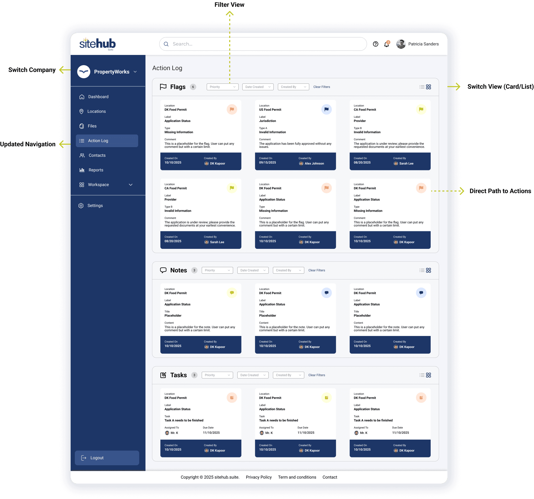
This page also offered the user to view actions in a card or a list view making it easier for customer to change preferences.
This page also offered the user to view actions in a card or a list view making it easier for customer to change preferences.
Each action has a "priority", "date created", and "created by" components. Filters let the user view actions based on these components.
Each action has a "priority", "date created", and "created by" components. Filters let the user view actions based on these components.
Additional Contributions
Additional Contributions
Additional Contributions
Onboarding
Onboarding
Redesigned the onboarding process by creating a self-service account creation and login system. Previously, new clients relied on employees to be manually onboarded, which slowed down adoption and created bottlenecks. The new design empowered clients to independently set up and enroll into the platform, reducing dependency on internal staff.
Redesigned the onboarding process by creating a self-service account creation and login system. Previously, new clients relied on employees to be manually onboarded, which slowed down adoption and created bottlenecks. The new design empowered clients to independently set up and enroll into the platform, reducing dependency on internal staff.
Redesigned the onboarding process by creating a self-service account creation and login system. Previously, new clients relied on employees to be manually onboarded, which slowed down adoption and created bottlenecks. The new design empowered clients to independently set up and enroll into the platform, reducing dependency on internal staff.
Account Creation
Account Creation
Interactive Modals with error status
Interactive Modals with error status
Reflection
Reflection
This internship marked my first experience as the lead product designer for an industry project addressing real challenges faced by users of a B2B SaaS platform. I re-designed key user flows of the Sitehub system and collaborated with the development team to translate solutions into reality.
This internship marked my first experience as the lead product designer for an industry project addressing real challenges faced by users of a B2B SaaS platform. I re-designed key user flows of the Sitehub system and collaborated with the development team to translate solutions into reality.
This internship marked my first experience as the lead product designer for an industry project addressing real challenges faced by users of a B2B SaaS platform. I re-designed key user flows of the Sitehub system and collaborated with the development team to translate solutions into reality.

Streamlined Communication
Streamlined Communication
I learned how intuitive interactions such as flags, notes, and tasks, can significantly improve collaboration and workflow efficiency across teams.
I learned how intuitive interactions such as flags, notes, and tasks, can significantly improve collaboration and workflow efficiency across teams.

Seamless Integration
Seamless Integration
I ensured the system maintained brand consistency and visual cohesion, integrating smoothly without disrupting the platform's overall look and feel.
I ensured the system maintained brand consistency and visual cohesion, integrating smoothly without disrupting the platform's overall look and feel.

Effective Prioritization
Effective Prioritization
I recognized the value of clear visual hierarchy through color-coded priorities, enabling users to quickly identify urgency and respond effectively.
I recognized the value of clear visual hierarchy through color-coded priorities, enabling users to quickly identify urgency and respond effectively.

View other projects